Multiple Ways to Implement Sticky Footers
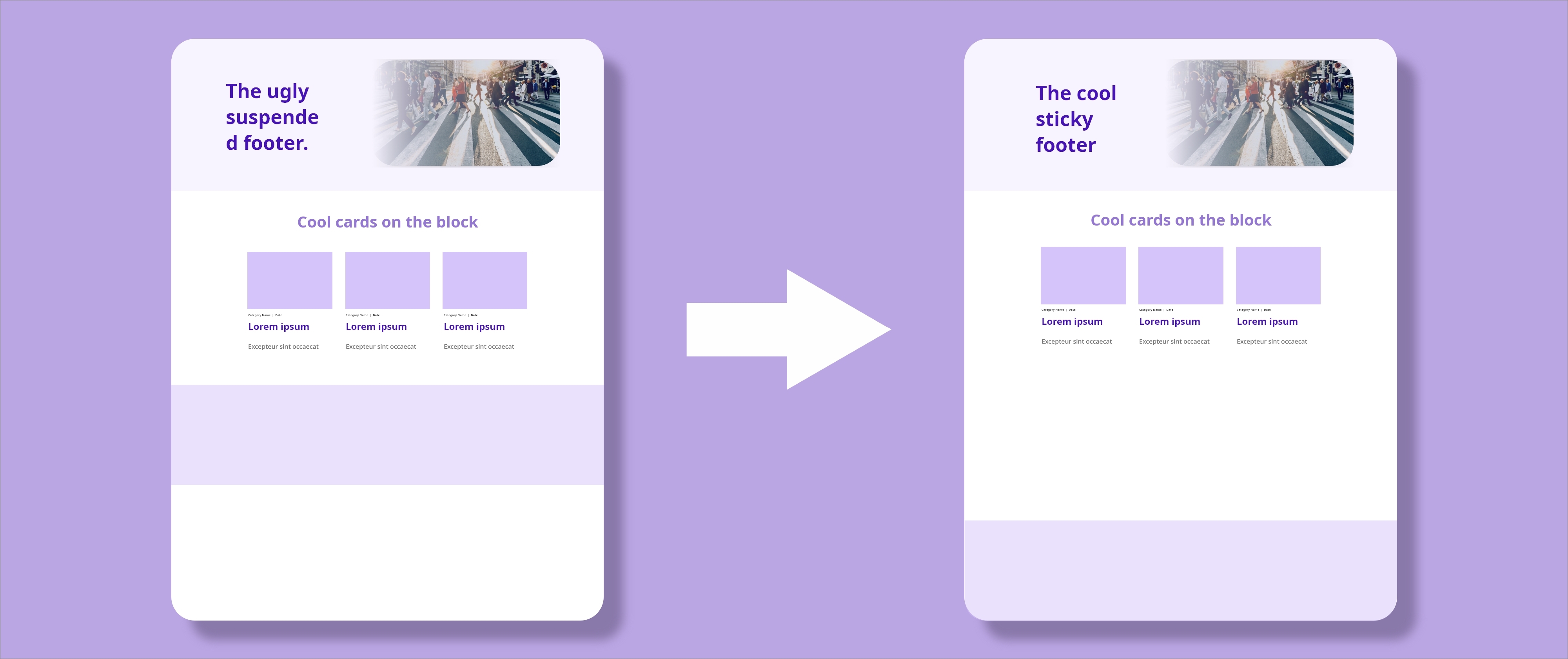
Sticky footers are what we call web page footers sections that stick to the bottom of the viewport when the total content height of a web page is shorter that that of the viewport.
They generally add a professional and sleek look to your website and are a must have in your website if you don't want to have your visitor's confused on the webpage's layout and mistake the empty space after the actual footer for being part of the layout, the cherry on top is that it let's visitors know that a proper professional developed the website and not an amateur.
On this blog I will try to show a couple of ways you can use to implement sticky footers with the help of CSS.
First start with the layout of the web page as this HTML part will be constant throughout the website, it will be styled up with CSS to achieve the intended look.
Webpage Layout
Break the page into three sections, the header, the content section and the footer. An important note on the layout of the page when intending to stick the footer to the bottom of the viewport, is to make sure that all the three sections together will take the height of the entire viewport even when the page's content is at minima . To achieve this wrap the three sections inside a container block and assign it's minimum height to that of the viewport. Here's the layout implementing this:
<!DOCTYPE html>
<html>
  <head>
	  <title>Sticky Footers</title>
    <style type="text/css">
    	body{
    		margin: 0;
    	}
    	.container{
    		min-height: 100vh;
    	}
    	.page-header, .page-content, .page-footer{
    		padding: 10px;
    	}
    	.page-header, .page-footer{
        text-align: center;
        background-color: #5f5f5f;
    	}
    	.page-header{
    		font-size: large;
    	}
    	ul{
    		list-style-type: none;
    	}
    	a{
    		text-decoration: none;
    	}
    	.page-header, .page-footer, a{
    		color: #ffffff;
    	}
    </style>
  </head>
  <body>
    <div class="container">
    	<header class="page-header">
	      <a href="#">Home</a> | <a href="#">Blog</a> | <a href="#">About</a>
	    </header>
	    <div class="page-content">

	      <h1> Cool Page Heading </h1>
	      <p> Footer can't touch me. </p>

	    </div>
	    <footer class="page-footer">
	      <ul>
	      	<li>
	      		<a href="#">Terms and Conditions</a>
	      	</li>
	      	<li>
	      		<a href="#">Privacy Policy</a>
	      	</li>
	      	<li>
	      		<a href="#">Help</a>
	      	</li>
	      </ul>
	    </footer>
    </div>
  </body>
</html>
As demonstrated in the above code the page's wrapper - .container has it's minimum height assigned to the height of the viewport - min-height: 100vh.
Running the above code on a browser we get a page that has the three sections but the footer being suspended on air which is not the end result we are after, we want it at the bottom of the viewport.
See the Pen A pen by James Sinkala (@xinnks) on CodePen.
Let's then proceed to viewing the ways we can implement with CSS to have our intended results.
CSS Viewport Heights and Percentages
In this setup we try to make sure that the minimum heights of the three sections sum up to 100% of the viewport's height while using CSS's viewport's height vh and percentage % CSS measurement units. We'll achieve this by adding the following code below our page's style:
- Using percentages
.container{
  height: 100vh
}
.page-header{
  min-height: 10%;
}
.page-content{
  min-height: 80%;
}
.page-footer{
  min-height: 10%;
}
The caveat with using percentages is that since it's a relative CSS unit thus depending on the parent's measurements we'll need to accurately get the viewport's height hence setting the container's height to 100vh so that the sections' percentages can relate to that. Running these changes on the browser.
See the Pen A pen by James Sinkala (@xinnks) on CodePen.
- Using viewport's height
.page-header{
  min-height: 10vh;
}
.page-content{
  min-height: 80vh;
}
.page-footer{
  min-height: 10vh;
}
Using the viewport's height on the other hand is straight forward hence no need to explicitly define and relate to the .container block's height since the vh unit means a percent of the viewport's height thus setting 10vh means 10% of the viewport's height and 80vh means 80% of the viewport's height. Running the changes on the browser:
See the Pen A pen by James Sinkala (@xinnks) on CodePen.
The above implementation gives us our intended results when you view the changes on the browser but not without some short comings. This is the worst way one can implement sticky footers and it has all to do with using the viewport's height. One will have to write so much code trying to preserve a consistent look to the webpages for different viewports as website's are viewed in a wide range of devices. It's not worth it.
CSS Positioning and Padding
In this setup we absolutely position the footer at the base of the relatively positioned container block, we give the container an explicit position so that the footer doesn't ignore it and position itself relative to the <body> as this will be problematic when the contents of the page surpass the page's viewport. And since out container's minimum height is the viewport's full height this is sufficient to stick the footer to the bottom of the viewport when we have minimum content.
.container{
  position: relative;
}
.page-footer{
  position: absolute;
  bottom: 0;
  left: 0;
  right: 0;
  height: 80px;
}
Testing the changes on the browser you'll find this implementation to be working out fine. When adding some content to the .page-content block you'll find that some of it will be hidden by the footer.
See the Pen A pen by James Sinkala (@xinnks) on CodePen.
This happens because when you position an element with the absolute property it is positioned in relation to the closest explicitly positioned ancestor, in this case the .container block and is out of the normal document flow thus stacked over the non positioned .page-content sibling and it's children. To fix this add some padding to the bottom of the .page-content section that is equal or more than the footer's height. This will make sure that whenever the .page-content section's content reaches the .container's base, it will push it by a minimum of the footer's height making sure the footer always obscures an empty space.
.page-content{
  padding-bottom: 100px;
}
Running the changes:
See the Pen A pen by James Sinkala (@xinnks) on CodePen.
CSS Flexible Box Layout
In this setup we apply CSS's flexbox layout to achieve sticky footers. Start by setting the .container's display to display: flex with a flex-direction: column to arrange our page sections as rows on a single column. Make sure that the 'page-header and .page-footer sections don't shrink below their content's height by setting a flex-shrink: 0 on them, afterwards let the .page-content flex item cover the remaining space left by the two other sections within the .container's minimum height by setting its flex-grow: 1.
.container{
  display: flex;
  flex-direction: column;
}
.page-header, .page-footer{
  flex-shrink: 0;
}
.page-content{
  flex-grow: 1;
}
Run the changes on the browser and you'll have a perfect page layout with the sticky footer properly placed.
See the Pen A pen by James Sinkala (@xinnks) on CodePen.
CSS Grid Layout
This is the easiest way to implement sticky footers by far, CSS's grid layout also lets us achieve sticky footers with the least amount of code. We only need one CSS code block to implement it:
.container{
  display: grid;
  grid-template-rows: auto 1fr auto;
}
In the above code we set display: grid to the .container block defining it as a grid container, then set grid-template-rows: auto 1fr auto which defines three grid row tracks set in one column since we didn't explicitly define them and the first and last tracks have a height as per the contents within them leaving the middle track set to a flexible unit 1fr which means it will take 1 fraction of the space and since it's the only flexible unit set will occupy all of the space left by the other two sections within the height defined by the grid container. Running the changes on the browser:
See the Pen A pen by James Sinkala (@xinnks) on CodePen.
And that's all what's needed to implement sticky footers with CSS grid layout.
The last two methods, using the flexbox layout and grid layouts are the top recommended methods when applying sticky footers to your webpages. The grid layout is the best way to go about it since it not only lets you apply the minimal amount of code to achieve sticky footers but this make the code easier to read, the flexbox layout can be an easy second for browser compatibility purposes.
All the best making the footers sticky.