Implementing Website Search with Vue.
In this article I'm going to show how you can implement a responsive search for your web project with the help VueJs and CSS. The search feature is going to be responsive to both user input and screen size without the use of media queries in the later.
As noted above this tutorial is broken into the responsivity of the layout of the search component and the responsivity to user input.
The Layout
I'll place more focus on the search itself and a bit on the page layout rather than the rest of the project setup since you can plug Vue into virtually any front-end project.
If you are familiar with Vue components and/or Vue's single file components then you'll know how to go about what I just said above, if not go do some reading on that.
The Page Layout
The following is the layout for our page.
<template>
  <div id="app">
    <div class="page-layout">
      <search></search>
      <div class="extra-content">
        <div></div>
        <div></div>
        <div></div>
        <div></div>
        <div></div>
      </div>
    </div>
  </div>
</template>

<script>
import Search from './components/Search'
export default {
  name: "layout",
  components: {
    Search
  }
}
</script>

<style scopped>
.page-layout{
  display: flex;
  width: 100%;
  height: 100vh;
  flex-direction: column;
}
.search-page > div:first-child{
  height: 50px;
}
.extra-content{
  background: #ededed;
  flex: 1;
  display: grid;
  display: grid;
  grid-gap: 10px;
  padding: 10px;
  grid-template-columns: 1fr;
  grid-template-rows: 100px;
}
.extra-content > div{
  background-color: #00d1b2;
  border-radius: 5px;
}
</style>
The important things to note in the above code is that we have our page container .page-layout that contains the search component on top of the rest of the page, in a project you'll likely have this on your navbar and have your logo and some links on either side of the search component. It's important that the first child of the page layout (the search box) is given an explicit height so that on the next part as the results will be displayed and likely extend the height of the search wrapper the page layout isn't distorted. We want our results to appear floating on top of the rest of the page content bar the search box's input.
It's good practice to break down our code into smaller reusable components that we can 're-use' in other projects that need same features instead of re-inventing the wheel each time thus saving valuable time, applying this thought process is why we have the search component on it's own, imported into the project's layout as an external component.
The Search Component
The following is the search component's layout:
<template>
  <div class="s-container">
    <div class="s-input-wrapper">
      <input type="text" v-model="query" placeholder="search">
    </div>
    <div class="s-results">
      <div class="s-result-placeholder" v-if="loading">
        <div class="placeholder-item" v-for="item in 3" :key="item">
          <div></div>
        </div>
      </div>
      <div class="s-result-items" v-if="!loading && results.length" v-for="(item, key) of results" :key="key">
        <div>
          <div>[[ item.title ]]</div>
          <div class="category">[[ `in ${item.category}` ]]</div>
        </div>
      </div>
      <div class="s-status-message" v-if="!loading && message">
        <p>[[ message ]]</p>
      </div>
    </div>
  </div>
</template>

<style scopped>
  .s-container, .s-results{
    position: relative;
    display: grid;
    grid-template-columns: 1fr;
    grid-template-rows: max-content;
  }
  .s-container{
    margin: 10px 40px;
    grid-gap: 5px;
  }
  .s-input-wrapper > input{
    height: 50px;
    width: 100%;
    background-color: #efefef;
    font-size: 1.5rem;
    padding: 2px 5px;
  }

  .s-result-items > div, .placeholder-item, .s-status-message{
    font-size: 1rem;
    background-color: rgb(255, 255, 255, .9);
    backdrop-filter: blur(10%);
    padding: 4px 5px;
    min-height: 30px;
    display: flex;
    justify-content: space-between;
  }
  .s-result-items > div:nth-child(n+2){
    border-top: 2px solid #d8d8d8;
  }
  .category{
    font-style: italic;
    color: rgb(158, 158, 158);
    font-size: medium;
    font-weight: 600
  }

  .placeholder-item > div {
    position: relative;
    width:100%;
    height: 22px;
    padding: 5px;
    border-radius: 4px;
    background: rgb(225,225,225);
    background: linear-gradient(90deg, rgba(227,227,227,1) 0%, rgba(207,207,207,1) 7%, rgba(207,207,207,1) 13%, rgba(227,227,227,1) 25%);
    background-size:900%;
    background-position: 100% 0%;
    animation: placeholder-animation 1s;
    animation-iteration-count: infinite;
    animation-timing-function: ease-in-out;
  }

  .s-status-message > p{
    width: 100%;
    text-align: center;
  }

  @keyframes placeholder-animation {
    0% {
    background-position: 100% 0%;
    }
    50% {
    background-position: 50% 0%;
    }
    100% {
    background-position: 0% 0%;
    }
  }
</style>
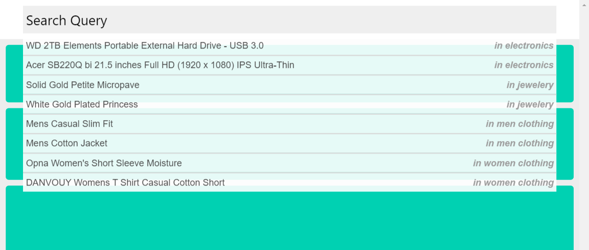
In the layout above we have our search input encapsulated in a div that's also the first row of a grid layout by the search wrapper .s-container . When the user types in the search query the search results will be the sibling rows to the input wrapper thus appear below it.
We also have the content placeholders inside the .s-content-placeholder wrapper that will be displayed as the search results are being fetched.
And the last child of these rows is a div .s-status-message which will be displaying a status message depending on the response we get from our servers.
Applying the grid layout on the search container .s-container and making sure each of it's children will occupy the full width with grid-template-columns: 1fr; this will enable us to achieve responsivity in respect to the viewport. 
User Input
The javascript part of our component is going to deal mainly with performing actions in reponse to the user input. Add the following javascript to the Search component.
<script>
import axios from 'axios'
export default {
  name: "Search",
  data(){
    return {
      query: "",
      results: [],
      loading: false,
      message: ""
    }
  },
  delimiters: ["[[", "]]"],
  watch: {
    query() {
      if(this.query.length >= 3){
        this.searchItems()
      }
      if(this.query.length < 3){
        this.results = []
      }
    }
  },
  methods: {
    searchItems(){
      this.loading = true
      this.message = ""
      axios.get('/api-endpoint',
        {
          data: {
            query: this.query
          }
        }
      )
      .then(response => {
        this.loading = false
        this.results = response.data
        this.message = response.someStatusMessage
      })
      .catch(error => {
        this.loading = false
        this.message = error.someStatusMessage
        console.log(error)
      })
    }
  }
}
</script>
As observable in the code above we use axios to make HTTP calls to our API.
Let's look at the reponsive data that we have declared on the data object: query: This is our input model that will carry the string being typed by the user. results: This is the results array that will be populated by the data that will be returned from the API request. loading: This is a boolean variable that will hold the status of our request. message: This will hold a status message if there exists one after our API request.
As the user is typing we watch the query variable to listen to the changes that are taking place, to get reasonable results and also not overwork our servers we wait until the search query is about three characters long before we send the API request. At the same time we clear the results when the search query is less than three characters long.
When we call the searchItems() method to initiate the API request we assign true to the loading variable so that the content placeholder animations are displayed to inform the user that something is happening behind the scenes. After we get our response we populate the results and message variables depending on the type of response we receive, also we update the loading variable to false to stop the placeholder animations since we have the data to display at hand.
Next we display the data as subsequent grid rows to the search input which will appear as follows. 
Some Optional Tips to Apply in Search in a VueJs Project
Here are some few tips that I might write an article on in the future but would just go brief on them currently.
- When you apply this search feature in a VueJs project the search results will likely have links to other pages just as you would on any other web project, to dismiss them as you navigate to the other page you'll need to listen to the changes happening to vue-router's $route.path property as follows:
<script>
...
  watch: {
    '$route.path'(){
      // Dismiss search results
    }
  }
...
</script>
- On the second tip you would query your server for all the items that exist in it and store them locally with the help of vuex and a persistence plugin such as vuex-persistedstate so that when the user reloads the website the data wont be lost. Afterwards for every subsequent search that will be performed by users the queries would be made to the item data pre-fetched and locally stored on the browser instead of making a new API call to your server on each search request. A point to be noted here is that this is a sound application if your database isn't being updated throughout the day, otherwise your users won't be able to query for the new added data.